Thursday, 6 October 2011

Marketing campaign of same genre as my own

.

Poster
Billboard

Teaser trailer

Interview with Tim Burton and Johnny Depp


The Marketing campaign i am going to be focusing on is for Tim Burton's Alice in Wonderland. I have chosen Alice and Wonderland as it has certain similarities as the trailer i am creating, 'Hansel and Gretel', they are both focused on a children's story with a classic horror twist. 
On June 22 2011 the first set of teaser posters were released featuring the first four main characters against backgrounds that more or less fit with their settings. So the Red Queen is set against heart-covered wallpaper, the White Queen against a series of white hearts, the Hatter against a kaleidoscope of hats and Alice is placed on a tea set with a background of key holes.

The second set of teasers took each of those characters – as well as others like Tweedledee/Tweedledum, Cheshire Cat and the Rabbit, and placed them within the film’s world. So the series of three posters features the characters standing amidst gigantic looking mushrooms and flowers and such. The three were then combined into a single banner with the Hatter in the middle, providing a nice look at the film’s style that compliments the trailers nicely.
The poster featuring The Mad Hatter, also then served as the theatrical one-sheet for the movie, with a credit block added to the bottom and Depp’s name added to the top. It makes a ton of sense for this to be used since Depp is going to be the main draw here for audience. The Marketing Campaigns main focus was released at this point by using Johnny Depp as its main selling product.

The teaser trailer was  released a couple months after Comic-Con which begins with  with Alice falling once again down the rabbit hole and once again swallowing the potion that shanks her down to size. We get quick introductions to most of the main characters – the White and Red Queens, the Cheshire Cat and everyone else – before we’re finally shown Depp as the Mad Hatter, who chides Alice for being late. There’s no plot to speak of, this spot is just about showing the audience the look and feel of the movie and hoping we’re intrigued by and sucked in to the visuals. Synergy is then brought into the campaign as now the phrases used on the posters can reflect themselves to the audience from the trailers. 'WE ARE ALL MAD HERE', 'YOU ARE INVITED'. The Marketing campaign for Alice in Wonderland focuses on a rang of taglines used to draw the audiences attention towards the film. The technique used in this marketing campaign is very similar to my case study of HPATDP2 as it also uses personal captions, used to attract a greater audience and appeal to them on a personal level. The later theatrical trailer shows off a bit more of the film’s story. While we get the same voice over intro from the Hatter and shown the rest of the characters as they realize Alice is back, we’re also shown why her return to Wonderland is important. It seems the Red Queen has taken over most of Wonderland and the Alice’s help is needed to set things right and restore order to the world.
TV advertisingfor the movie toward the end of January, with the debut of new spots being made into events on ABC, ESPN and ABC Family. That push then culminated with a Super Bowl commercial in early February that exposed the film to a broad moving loving audience. The studio also engaged in a a bit of outdoor advertising, re-purposing elements similar to those of the triptych poster billboard campaigns.

Synergy between trailer/cover/poster


Synergy is the empire of a media marketed product. It creates a greater audience and allows audiences to get involved with the whole idea of the film, especially one such as Harry Potter. Harry potter appeals to a world wide audience of all ages which renders the fact that harry potter hit the nail on the head when it comes to a marketing camping. In March 2011, the first preview for Harry potter and the deathly hallows part 2 was released showing new before seen footage of the upcoming production. The first US poster as released on march 28th with the caption 'it all ends here' initiating the marketing campaigns greatest catchphrase. The phrase was repeated on many other posters which heightened the appeal from viewers as the reality of the trilogy ending took its toll. Another important aspect of the product marketing camping is the actors themselves. They have became iconic figures throughout the trilogy. During the MTV awards Emma Watson on June 5 2011 presented a sneak peak of the film.

Synergy is an important aspect of any marketing campaign. It is the baseline to the production, marketing and selling of any product. HPATDHP2 has been marketed through magazines, posters Ipod applications, and feature trailers which has allowed it to become one of the biggest blockbuster phenomenons to this day. The synergy created builds excitement and hype allowing further viewers and fans to be involved. Considering it is the final film builds further hype and fans see the merchandise as collectables as this will never happen again. The whole idea and character portrayed and created takes fan base to a whole other level, Harry potter has became a world wide recognized figure throughout the media world and the final build up to the film is topped off with the bold catchphrases reminding the audience that it is all coming to an end. 'IT ALL ENDS HERE', 'THE LAST CRUSADE', 'THE PERFECT FAREWELL'. they all consist of a piercing message which sticks with the audience making them want to savoir every piece of the end to a piece of many peoples childhood.

The marketing used through film magazines is very clever as the house style has changed to gold which creates a feeling of royalty and specialty highlighting the importance of this final film. The magazine has chosen to use an image of the actors as themselves instead of the characters they play. I believe the importance of this image is to show how the film and actors are so world widely recognized they can be shown as themselves and people will still know who they are.

Roland Barthes theory

Barthes is famous in media for suggesting that narratives work with five codes:
  • Action or proairetic
  • Enigma or Hermeneutic
  • Semic
  • Symbolic
  • Cultural or referential
The enigma code is the most famous as we use this to make guesses as to how the narrative of a film will finish, therefire providing pleasure for the audience.

Hermeneutic Code
This is when parts of the story are not fully explained. They exist as enigmas or questions that the audience wishes to be resolved. Detective stories (e.g. Sherlock Holmes) have narratives that complies with this code - a criminal act is shown and the remainder of the narrative is devoted to answering questions raised by the initial event.

In order to maintain interest, the final truth is not revealled until the end and some devices are used to conceal it:
  • The snare - deliberate avoidence of the truth. A tease or implication that sends the audience down the wrong path e.g. Snape from the Harry Potter films - is he really a villain or are we just being mislead?
  • Partial answers - revealling some final truths - this is used to increase suspense
  • Equivocation - mixture of truth and snare - usually makes the story even more mysterious and confusing
  • Jamming - suggests that a problem may be unsolvable - further incerases suspense
Proairetic Code
The proarietic code is a series of actions that imply further action/reaction. For example, a character may have an argument and the audience wonders what the resolution or outcome of this argument will be. This creates suspense and tension as the audience wonders what the outcome will be and begin to make their own guesses.

Claude levi strause theory

 Strauss argues that meaning in narratives is based upon binary opposites (conflicts). He was less interested in the arrangement (or syntagmatic)  of the narrative (or order) and more in the deeper meaning (or paradigmatic) of the themes.

Examples of Binary Opposition
man vs. woman
science vs. nature
good vs. evil
earth vs. space

Queer theory

The queer theory is a field of gender studies that emerged in the early 1990's out of the gay/lesbian studies and femminist studies. Although many believe that the queer theory is only about homosexual representations in literature, it also explores categories of gender as well as sexual orientation. It is not only concerned with sexuality but also with identity.

It sees gender as constructed socially to some extent through out association with the media. For example, gender stereotypes are conveyed clearly through the cartoon programme Scooby Doo:


Daphne wears make-up and feminime colours like purple, and all these features represent a strongly feminime girly-woman

 
On  the other hand, Velma's square glasses, feckles, unstyled haircut and oversized/unfashionable orange jumper make her appear less feminime and attractive than Daphne. Could Velma be a stereotype of a cartoon lesbian? 

 
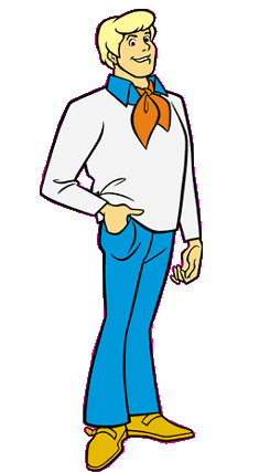
Fred is tall, well-muscled and well-dressed. He is typically handsome with a groomed haircut and clean-looking haircut. Fred is the typically attractive man that the typically attractive woman (like Daphne) would be paired with

Vladimir prop

In Propp's theory, he examined hundreds of folk tales and concluded that a formula was commonplace, including:
  • 8 character roles or spheres of action (character and action being inseperable)
  • 31 functions, always highly predictable such as villain being punished at end of story
Character Roles
  1. The villain - represents evil and struggles against the hero (e.g. the Joker in The Dark Knight)
  2. The dispatcher - character who makes the problem in the narrative known and sends the hero on his way (e.g. Commissioner Gordon in The Dark Knight)  
  3. The helper - helps the hero in his quest (e.g. Alfred in The Dark Knight)
  4. The princess/heroine - the hero deserves her throughout the story but is unable to marry her because of an unfair evil, usually because of the villain. The hero's journey is often ended when he marries the princess, thereby beating the villain (e.g. Rachel in The Dark Knight) 
  5. Her father - often rewards the hero with the princess/heroine (e.g. The Sultan in Aladdin) 
  6. The donor - prepares the hero or gives the hero some magical object to help him in his quest (e.g. Lucius Fox in The Dark Knight) 
  7. The hero - the centrail protagonist who leads the way in the narrative (e.g. Bruce Wayne/Batman in The Dark Knight)  
  8. False hero - takes credit for the hero’s actions, is usually good looking and is often actually a coward (e.g. Harvey Dent in The Dark Knight)

Detailed analyisis of 2 film magazine covers


The first film magazine cover i am going to analyse is the Harry potter 7 edition of the empire magazine. Empire is one of the most popular and celebrated film magazines. Film magazine front covers create a hype about a movie - dramatic-looking imagery with well-known actors on the front cover will entice an audience to want to know more about it. Front covers will often contain positive quotes about the film or quotes from the actors in it, which further creates a interest and brings in a wider audience.

This magazine incorportates the realease of the Harry potter film, a worlde wide event which targets a global audiance. The Mast head follow the traditional path of empire magazine fonts, using the usual red colour skheme. There is a large strap line accros the top were it self explanets the quality and features of the  magazine. The magazine uses clever sell lines to create an exciting teaser for the upcoming film using strong subheadings such as 'heroes' and 'legends'. There is a clver catch line 'friendships shatter, evil units' wich replictes with the shattered glass were the key essentail characters refections are visible. This arrangement along with the Bold Yellow text saying ‘Friendships shatter’ and broken glass connotes that the friends are falling apart. The other slab of broken glass contains a reflection image of Ralph Fiennes character ‘Lord Voldemort’ who however is not looking in the camera lens, is looking up towards Harry Potter connoting that he is engaging in battle against Harry Potter. All character looks fierce and angry.
The main image is of Harry potter witch is an important key to the magazines success as they are using daniel ratcliff to sell the magazine. The lighting in all photos is used effectively to show the extent to all facial expressions and detail on their faces along with make up. There is a range of puffs used to appeal t the audiance using sharp buzz words such as 'must see' and 'best'. The clever use of yellow contrasts against the dark magical house style which makes sure the important information to be read is noticable.


The Poster i am going to compare the harrypotter marketing cover with is the thrilling will smith performance in I am legend. I chose this cover as it compares with the layout iudeas i would use to promote my film through a magazine. The genre of the film is cleverly portrayed by the dark mistic background. Again the magazine used if the empire so the traditional housestyle is shown with the red mast head. however a further use of red is shown for the subheadings as it conotates danger and death relating to the thrilling storyline. The use of Props in these poster are important as in Hp7 a wand is clearly visible showing that the film had magical relations, in this case a gun is used to show the film consists of a more serious scary nature. The strap lines follow the same marketing path using buzz words such as 'bestever'. The Subheading is of the films title 'i am legend' the word legend is highlighted for extra audiance appeal witch relates with the highlighted headings witch are gong to gain the audiances attention. The magazine mainly uses its main image to sell the magazine and sell the upcomging film. the clever postioning of the image does not reveal much however the facial expression, gun and mist entitles that the film consist of a gripping tense story. the magazine cleverly shows this wich is important when transfering the films appeal to a large audiance. Diffirent techniques were used for this cover as with harrypotter a guaranteed sell out is expected as a world wide recognistion of daniel radlciff quickly informs the audiance what the film is about. Although Will smith is clearly visble and wellknown more information is needed on the cover. 'in newyork for will smiths epic scifi horror'